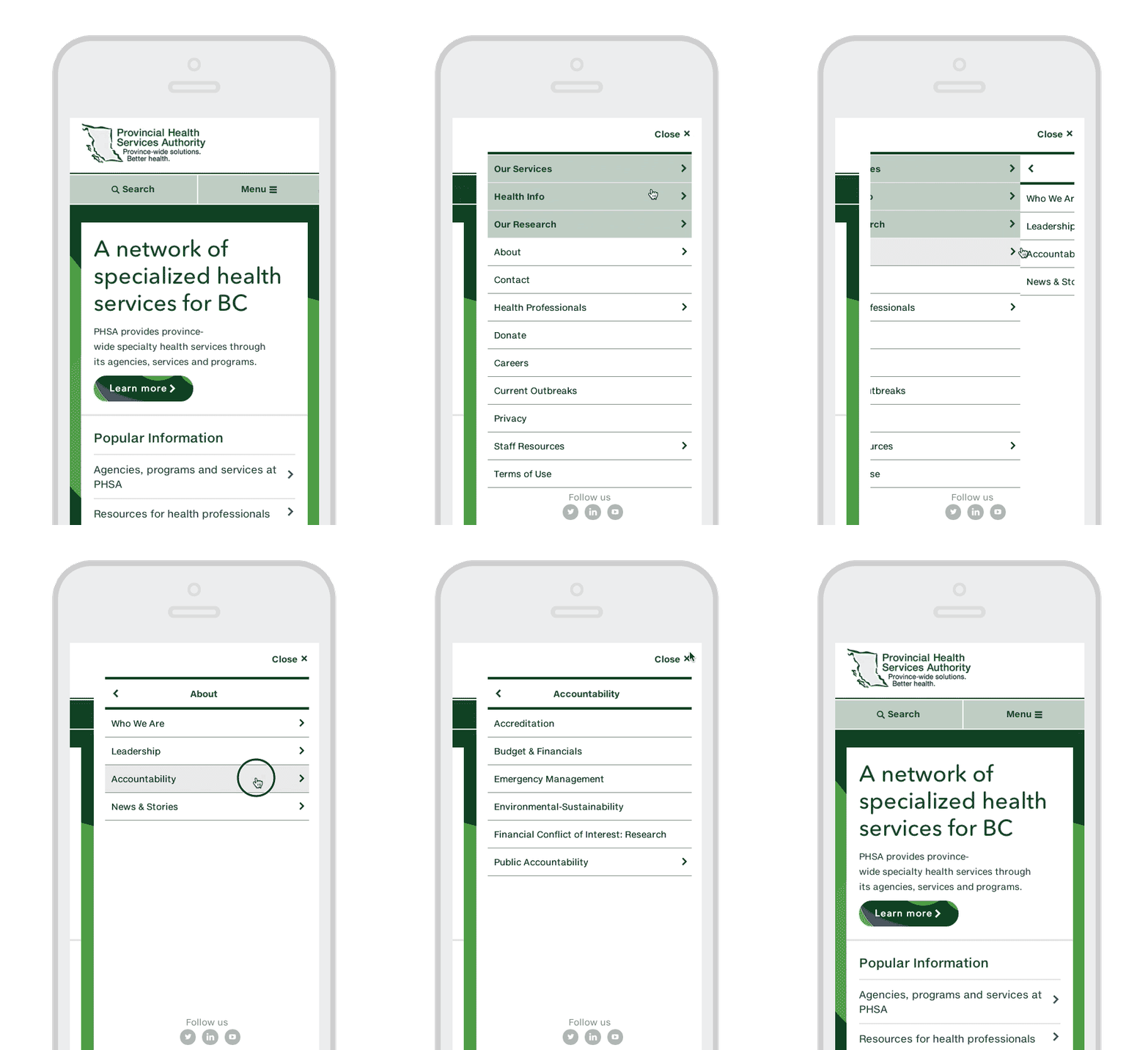
The menu changes slightly on a tablet or mobile device because of the limited amount of screen space.
The channels get collapsed into a "hamburger" menu. When clicked, the channels, sections and pages display in individual screens as single columns.

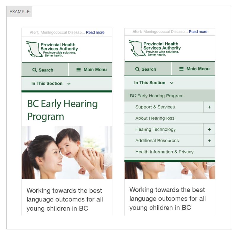
Once the visitor gets to a page, the “In this section” menu will appear just below the main menu.
When the visitor clicks the In this section menu, it will expand to show the subpages on the page.

Right margin items change
Any feature boxes in the right margin of a page (such as related links or documents) will drop to the bottom of the page. If it is very important for your visitor to see a related link or document, you might add the link to your page content area. This will ensure visitors who might not scroll to the end of the page will still get the content they are looking for.
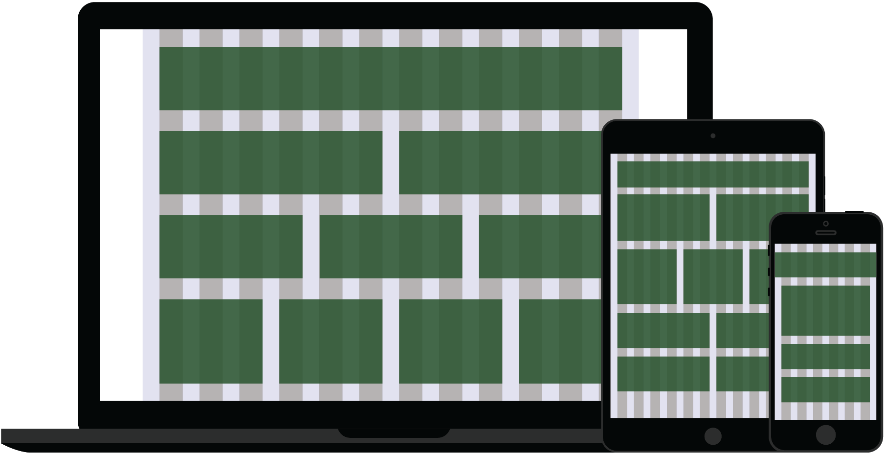
Here's another image of how layout will adapt to optimize the viewing experience for different screen sizes ranging from big desktop screens to mobile phones. For example, a four column layout on a desktop computer may be rendered as a two column (or single column) layout on a mobile device.


