Choosing images
Try to find quality photographs that don’t look too much like stock photography, but not like the pictures on Craigslist either. This is of course subjective, but here are some tips.
Try to use photographs with people in them. It’s ok to make exceptions, but too many pictures of only objects will give pages a very anonymous and generic feel. People are drawn to pictures of people, especially faces.
Never use pictures of icons, illustrations or graphics unless approved by the Communications department.
Don't use icons like this as pictures:

Don't use graphics like this unless approved by Communications:

Don't use 3D graphics like this:

Pictures of people and objects should portray them in their natural enviroment. Never use pictures of people or objects on a isolated (single coloured) or graphical background.
Don't use pictures of people on a isolated (single coloured) background:

Don't use pictures of people on a graphical background:

Don't use pictures of objects on a isolated (single coloured) background:
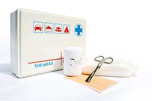
Do use a picture of an object in its natural enviroment:

If there are people in the picture, they should look like real people and not models:

Robots

Humans
There should be a good colour balance, avoid pictures that are overly saturated or too white:

Too white

Too saturated (bright colours)

Colourful but not overly so
Depth of field (when the background is blurry/out of focus) can make pictures look more professional. Also consider lighting, colours and composition.
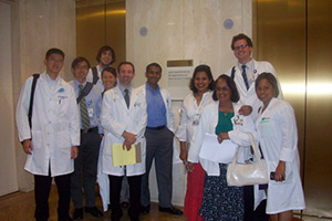
This picture has poor lighting, colors and composition. It looks like it was taken with a cellphone camera:
This picture is a good example of depth of field and colour balance:

Make sure you crop pictures so that important things aren’t cut off. If you crop a person, make sure they are high enough in the picture so they don’t look like they’re ducking:

Bad cropping
 Better
