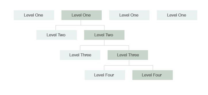
The structure of a website is called its information architecture (IA). Navigation areas on a page show where the page fits in the IA.
Navigation is an important part of a website. This is the system that allows people to find what they are looking for.
Websites are organized in a hierarchical structure that allows people to find information based on increasingly specific labels.
When we talk about navigating these labels, we refer to them as “levels” of navigation. This is based on the metaphor that users are navigating “deeper” into the information.

To better understand what kind of content belongs in each one of these levels, it is best to think of a text book. The information in a text book is divided into sections, subsections, topics, and subtopics.
The first level of navigation (the global navigation across the top of the site) was designed to be consistent across all organizations. While some of the vocabulary may change slightly depending on organization, the first level of navigation contains three primary tabs that contain important public facing information. The other 4-6 secondary tabs cover information that is applicable to all audiences, and has a section specifically for health professionals.
The second level of navigation breaks up each of these sections further. These sub-sections are referred to as "buckets" because they don't contain any information on their own and instead serve as containers to hold pages that have content. The focus of the second-level navigation items is to help the user narrow their options and allow them to more quickly get to the topic they
are looking for.
The third level pages contain most of the content. These are broken up by topic and sorted into the second level "buckets" to make them easier to navigate.
The fourth level of navigation breaks up the third level information further in the case that there is a lot of information in the topic.
The same pattern of dividing the information holds true for the levels deeper than forth level. As much as possible, we recommend not going beyond four levels of navigation because it over-complicates the navigation and leads to the creation of a large amount of redundant overview pages. It is a much richer user experience to have a detailed page of content to explore rather than a series of links that take them deeper through a path of diluted and divided content.
We have included design features that can help you keep the amount of pages to only four levels; see
Pages.

